OPINION
Rituals and rites: An exploration of archetypes and human behaviours
Journalist Clare Dowdy discusses the role and significance of archetypes in design and architecture with Universal's principal and directors Jason Holley, Paul Gulati and Carly Sweeney - from the humble communal table to the ideology of the ‘town square’ as a vehicle for gathering in spaces.
When it comes to thinking about how people can use a space, archetypes can be really effective. Archetypes are elements which recur in certain settings, and articulate something universal about the human experience. Because they are familiar to us, they can represent a shared set of values or symbols that go beyond an individual’s experience of a space. Universal director Paul Gulati likens archetypes to a language: “It’s not just for one person, and it already exists in the lexicon.”
For Universal’s creatives, there is a value in tapping into archetypes for all sorts of projects, precisely because they’re already understood by people. “Archetypes feel conservative but they’re a really useful vehicle for moving forward,” Jason says.
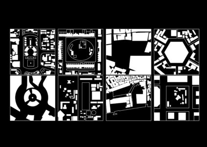
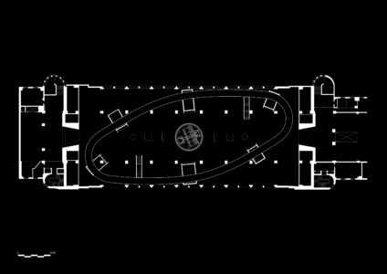
The team identifies the source of some recurring archetypes. The German Pavilion, designed by Ludwig Mies van der Rohe and Lilly Reich for Barcelona’s 1929 International Exposition, epitomises the use of the absolute minimum essential elements that still express the pavilion archetype with carefully assigned materials; Louis Kahn's 1953 Yale Centre for British Art references several archetypes including the English country house (hence its series of interconnected rooms surrounding a 'great hall', with a large cylindrical curved form containing a staircase and lifts evoking the 'hearth'); and Ricardo Bofill’s 1970s La Fábrica outside Barcelona is the archetypal adaptive re-use of an industrial building – in this case, a cement factory. “This is a project we reference very often for how it translates the industrial building into a domestic and studio setting,” Jason says. Even ancient Romans have something to teach; their elliptical Colosseum is “the ultimate archetype for an amphitheatre with modern arenas and stadium design still based on many of its key features.” he adds.
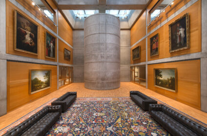
But nowadays, to make an environment really sing – with people delighting in it or even taking ownership of it – archetypes are rarely deployed literally. Instead, they’re reconsidered, recontextualised and sometimes turned on their head.
“The act of reconsidering what’s typically used in a certain scenario gives us something to pin the whole project on,” says Paul. That way of working takes people beyond their expectations.
Archetypes that Universal has adapted and reinvented range from the large-scale - architecture - to the small-scale - furniture. They’re treated as a starting point on many projects, and help the client leave preconceptions of their specific sector behind. The town square archetype - an open public space in the heart of a town enclosed by buildings of different uses, often with a monument or fountain at its centre – immediately invokes a gathering place. It’s become a staple of modern workplaces, but Universal has transported it out of that sector and into a cultural space.
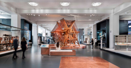
Information Age is the London Science Museum’s biggest gallery to date, and explores the history of information and communication technologies through more than 800 artefacts. Universal’s aim was to encourage visitors to dwell there, and so the team based the organisation of the gallery around the spatial typology of the town square. At its centre is the gallery’s biggest object: the rugby Tuning Coil. Around that runs a walkway that penetrates small pavilions whose ‘shop fronts’ face into the central courtyard. Here, in a museum, was an expression of civic life, says Jason.
“I wouldn’t expect visitors to notice the town square,” he says of Information Age, “but that archetype taps into something quite fundamental – people’s embedded experience of certain places and rituals.”
And as the familiarity is there, “visitors intuitively gravitate towards the sculpture and navigate around it,” says Universal director Carly Sweeney. So here is an archetype reimagined and relocated, which by redeploying certain cues in a new environment nudges people to feel and behave in a certain way. In short, they lingered.
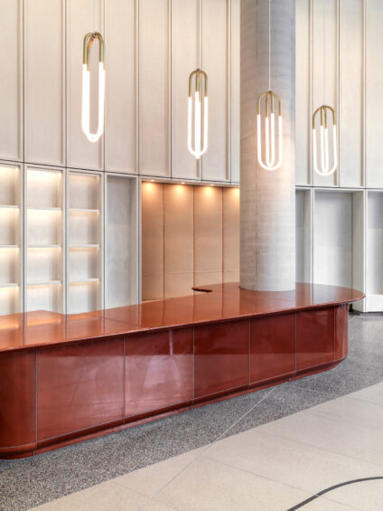
This approach was reversed in the city. A big corporate office typically comes with a big corporate reception desk in a big corporate lobby. But at British Land’s 100 Liverpool Street, Universal put the reception desk on the first floor and filled the ground floor with the aroma of fresh coffee – an archetype more usually associated with the hospitality and culture sectors. There’s a long espresso bar, and high tables and stools line the façade. The familiar yet unexpected set-up encourages staff, visitors and even passersby to enjoy the ground floor – quite a contrast to the formal welcome that traditional city offices offer.
“This recontextualising of archetypes is part of the creative act,” says Paul. “When people smell the coffee in 100 Liverpool Street they understand that they can behave differently.”
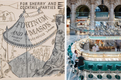
Likewise, people typically expect to come across a champagne bar in transient places like airport terminals and international train stations. And indeed, Universal had already created one such bar for Fortnum & Mason at Heathrow Terminal 5. For its second site beyond Piccadilly, the upmarket department store chose London’s Grade I-listed Royal Exchange. This address presented an opportunity to introduce the 300-year-old brand to a new audience – which meant coming up with a modern expression of the brand.
“By giving people an understandable, readable language of the space or the form, they’re also getting the opportunity to focus on what’s unique about that particular experience with the brand” — Paul Gulati
“We wanted to create a moment of indulgence, quality and luxury,” Carly says, “So we took one of F&M’s key historic references - making gourmet products for exploration and travel – distilled them and put them in a different context.” The champagne bar’s canopy is a nod to the shelter of a parasol or tent that intrepid travellers in a bygone era would have erected on the side of a mountain before embarking on an F&M high tea with all the trimmings. And the Piccadilly store’s high standards of service were replicated at Royal Exchange.
"It’s not always just about recreating a physical manifestation of an archetype.” — Carly Sweeney
Unearthing forgotten qualities of a heritage brand brings joy to people, but Jason cautions that there are risks of straying into pastiche, if executed less than thoughtfully. And for any brand, “there’s a danger of taking an archetype and just replicating it time and time again, then its meaning dies.” Instead, the aim is to pull that into something that feels relevant for now, and also offers new opportunities for brands to do things, he adds.
There is a logic to exploiting archetypes – where appropriate. “Because by giving people an understandable, readable language of the space or the form, they’re also getting the opportunity to focus on what’s unique about that particular experience with the brand,” Paul says. “That means they’re not having to do too much hard work to get their head into what matters.”
People only have a certain amount of attention or ability to unlock all the different things they need to appreciate an experience. If only a few elements are new, then the experience is more likely to resonate with them. “The other elements just sit in the background because they’re contained in the archetype, which is already received and understood and accepted,” Paul adds.
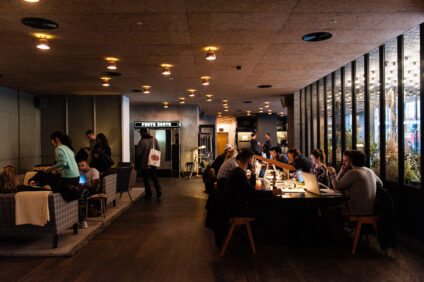
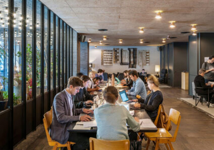
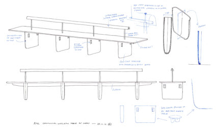
One of the best understood archetypes is the communal table. From ancient Rome and the medieval refectories, to libraries and 20th century casual dining, the communal table has already cropped up in a number of scenarios. Through Universal’s recontextualising of this archetype, Ace Hotel Shoreditch became the venue for a bold experiment in connecting communities. A long, painstakingly-designed and thoughtfully-lit table stands near the window in the lobby as a place for locals and hotel guests to sit, work, read and chat.
“A table is always an opportunity to bring people together,” Carly says. “A hotel lobby is very transient, a place where strangers cross paths. At this table with its low light levels, you don’t feel on show, and that encourages a different type of behaviour. It quickly became a massive co-working draw, you could hardly get a seat there.”
And embedding power sockets into the table sent out a subliminal message that people were encouraged to dwell. This was unusual at the time, as other hospitality clients were actively discouraging people from hanging out. So the table acted as “a symbol that this was a social hub, open to all”, Jason says, and “it was a nudge forward” in changing people’s behaviour."
What do reassuring, familiar archetypes have to offer when faced with a whole new typology? At the Soho HQ of Copper, a crypto-currency hedge fund, Universal played with two very different archetypes: the comfortable, predictable, traditional members’ club, evoked by plush seating and rich materiality; and the intangible, digital nature of crypto, represented by a digital artwork pulsating with light that references the server room. The result is a nod towards a hospitality experience – again defying sectors in favour of something that speaks to how humans want to behave.
Why bother with reimagining and recontexualising archetypes? “They need to evolve,” says Jason.
“How we use spaces, and our expectations are always changing. Archetypes are the survivors of that evolution. They’re the traits that have shown themselves to be most beneficial to people.” — Jason Holley
In contrast, “things that people reject don’t become new archetypes,” he adds. Bleacher seating – as seen in some workspaces and even McDonald's – might fall into this category. When it’s not occupied, it can look superfluous - like an event waiting to happen.
Despite their usefulness, archetypes are no quick fix. If they’re used without care, or as a lazy way to signal an intention (‘we are communal’), there’s a risk that they’ll backfire. Then it’s form over function, more about the image than how people use it. Instead, the experience that people feel is brought alive by the detail, like Ace’s table, whose designers agonised over the distance between chairs and how the light dispersed across the surface.
“At the end of the day, whatever you’re doing has to resonate with someone, or contribute something, or be meaningful.”
Such success comes from a three-fold approach: the human-centric research that goes into the space and its intended uses; a deep understanding of the brand or business; and an appreciation of the roots and meaning of the archetype.
Image credits:
Fortnum & Mason at The Royal Exchange, Photo by Andrew Meredith
English country house at Yale Center for British Art, Photo by Richard Caspole
Tuning coil in London Science Museum’s Information Age gallery, Photo by Andrew Meredith
Reception desk at British Land, Photo by Charles Hosea
Lobby of former Ace Hotel in Shoreditch, Photo by Andrew Meredith
