PROJECT

Cold War Modern

Retelling the Cold War through the lens of art and design at the V&A

Universal Design Studio's first foray into exhibition design for a globally renowned cultural institution
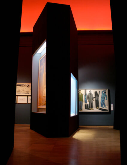
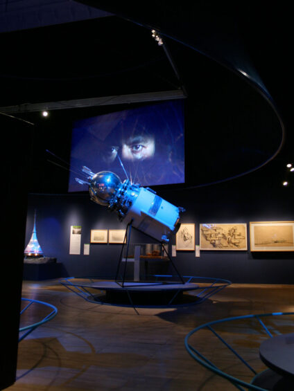
Cold War Modern was a temporary exhibition at the V&A that explored how art and design were affected by, and influenced, the events and tense political atmosphere of the Cold War era.

Covering over 500 exhibits, including media, painting, sculpture, graphics and consumer objects from the period - from a Sputnik and an Apollo mission space suit to films by Stanley Kubrick, paintings by Robert Rauschenberg and Gerhard Richter, fashion by Paco Rabanne, designs by Charles and Ray Eames and Dieter Rams, architecture by Le Corbusier, Richard Buckminster Fuller and Archigram, and vehicles including a Messerschmidt micro-car.


The project was a key moment in our evolution as a studio as it was our first project for a major UK cultural institution. It was also an opportunity to take the storytelling skills we had been using to create compelling brand narratives within retail environments and apply them to exhibition design. This focus on storytelling and the experiential found its perfect partner in Cold War Modern where the purpose of the exhibition was to provide a dialogue between the objects and the context they were designed within.

We saw an opportunity to create environments that triggered certain emotional responses that would reinforce the ideas of each chapter within the exhibition. For example, in the section titled ‘Anxiety and hope in the aftermath of war’ we explored how geometry and colour can provoke strong emotional responses, by creating an environment from black fragmented monolithic plinths set under a red coloured sky within which to display the objects.

The exhibition design addressed each of the seven sections individually, which were then linked into an overall narrative. Design continuity was maintained through consistent architectural details, colour application and large graphic installations. Colour was a major mechanism used throughout the space in creating atmosphere, and legibility. Each ‘chapter’ was given a colour story, which was then applied to all designed surfaces, showcases, plinths, graphics, and partitions. The resulting design created a rich mix of spaces that linked the object heavy exhibition into an overall and cohesive narrative journey.