PROJECT

Can Graphic Design Save Your Life?

Exploring the connection between graphic design and the healthcare industry

Dismantling the hierarchies between two-dimensional and three-dimensional design
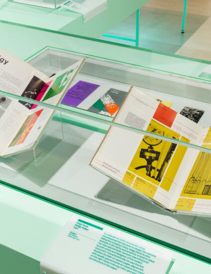
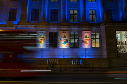
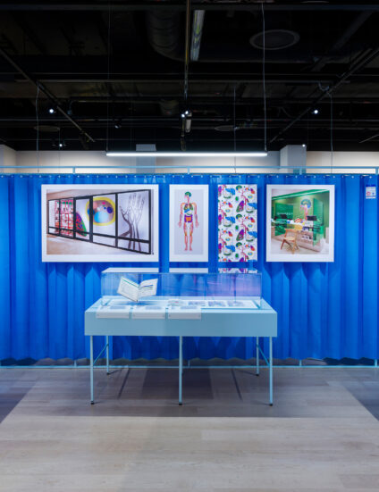
Can Graphic Design Save Your Life? explored the role that graphic design plays in storytelling and communicating messages around healthcare across the globe. Created for the Wellcome Collection museum and library in London, the exhibition featured over 200 objects including posters, photography, film, books, and packaging that illustrated the varied nature of graphic design and how its widespread use can shape the environment and our health.

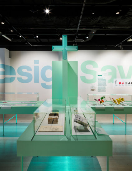
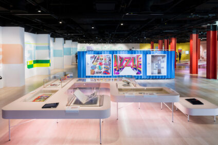
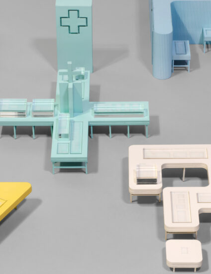
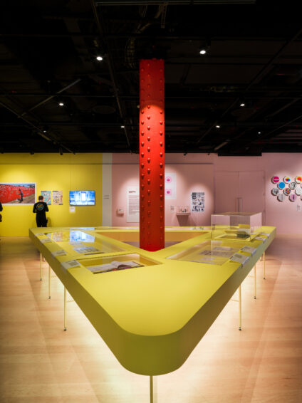
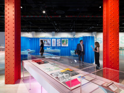
Given the exhibition’s subject matter, we sought to create a seamlessness between the graphic and spatial design for the space. For example, the letters of a large graphic that ran across the gallery wall were stretched over the wall’s folded surfaces, highlighting the interior architecture in the process. In addition, the display plinths—which took the form of oversized symbols—demonstrated how graphic design can be translated from two dimensional surfaces into three dimensional objects, surfaces and spaces.

"Looking back this is probably one of the projects that I am most proud of, content and design-wise. It felt very personal. Universal's sensibilities around materials and form made them the best of partners." — Lucienne Roberts, Founder, LucienneRoberts+
Interview: Universal's Satoshi Isono in conversation with Lucienne Roberts

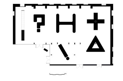
Each exhibition section was carefully curated to explore a specific subject, reinforced by the colour and form of its corresponding display plinth. The gallery space’s open-plan layout meant that the plinths were visible from everywhere, giving each section equal hierarchy and making it easy for visitors to navigate through the space

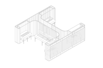
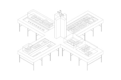
Well-known healthcare iconography influenced the design of each exhibition area - for example, the ‘Medication’ area featured a plinth in the shape of the pharmacy icon cross and was also illuminated in pharmacy green. Isometric and plan drawings of the space illustrated how the symbols were adopted for three-dimensional form.

“I think it’s an understandable mistake to think that graphic design is about selling things, or making something pretty. We’re coming at it from the other end, to show that it can educate and raise awareness."—Lucienne Roberts quoted in AIGA Eye on Design